I'm currently attending The Art Institute of Seattle and I love it, I was going to school for engineering but realized it wasn't for me. I am so glad I decided to go to school for web design, this is definitely what I want to do with my life! I enjoy different perspectives and I strongly believe that is the best way to grow, seeing another view and incorporating it into my own work is how I make my work better.
Seattle Skyline

Monday, February 11, 2013
Sunday, February 10, 2013
Tuesday, February 5, 2013
Sunday, February 3, 2013
Project 2 Research
I decided to do my interactive PDF on Russell Wilson. Each location will have a roll over opening a set of statistics with comments from articles. also I wanted to add interactive parts to the inside of the rollover areas. When it talks about his hight I want the two figures to change color with rollover. Also for the Jersey when the rollover opens I want the college Jersey to appear black and white but when the mouse hovers over it I want the colors to change.
Saturday, February 2, 2013
Logo
A logo I recently designed for a friend, he wanted speakers in the image and simple color scheme so this is the final logo after giving him about 5 different ideas.
Tuesday, January 22, 2013
editorial final illustrations
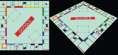
One of the illustrations for the editorial, I played around with the google favicon. I wanted it to resemble the monopoly character.
For this one I took the four corners of the board and tried to incorporate it into the favicon.
Finally I think this one is my favorite, I just have to decide which view I like :/ I broke down the monopoly board to a pretty simple form just to the point where everyone knows what it is without all the words and lettering, and well change the name ;D
Saturday, January 12, 2013
Thursday, January 10, 2013
Tuesday, January 8, 2013
Katharine Asher


Katharine Asher does amazing illustrations, they're simple but get you to draw your own conclusions about who you think these people are, what they're feeling, and what they're thinking. I love to look at her illustrations facial expressions and try to come up with a story behind the drawing. Another aspect I really enjoy is a lot of her pieces focus on one bright color, making it impossible to ignore, they almost beg for your attention.
Google Antitrust Case Article Illustration
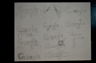
I chose to do my illustration for an article in the Seattle Times about google's antitrust case. Google is being accused of monopolizing their search engine by putting their results first. This is the rough sketches for my idea.
http://seattletimes.com/html/opinion/2020061459_editftcgooglexml.html
http://seattletimes.com/html/opinion/2020061459_editftcgooglexml.html
Monday, January 7, 2013
Chris Ede
Ede's style has a lot of graffiti technique and most of his focal colors are bright teals and reds. I really enjoy his illustrations, some are poking fun at sayings or highlighting sports athletes and teams. I love his diversity in images, some seem dark and sinister where others are really bright and have a happy or calm mood attached to them. His style is easy to pick out but the final works are all over the place making him extremely entertaining you never know what's coming next.
http://www.illustrationweb.com/artists/ChrisEde/view
http://www.illustrationweb.com/artists/ChrisEde/view
Editorial Options
For this assigment we are required to find editorial articles and create an illustration for the text.
http://union-bulliten.com/news/2012/dec/31/its-an-rg3-vs-r-dub-3-showdown-in-nations-capital
The first article talks about the rookie rivalry between RG3 and "R
Dubb 3" (russell (R) Wilson (Dubb for the W) 3 (third round draft pick).
Both have amazing stats and now it's the game they go head to head.
In the second article I found it talks about how drafting Russell Wilson for the Seahawks would drive the writer mad. He feels that the Seahawks are always "experimenting" with quarterbacks and it never gets them anywhere. Russell Wilson is "too short," "can't see over the line," and how there is no other quarterback in the league at 5' 11."
In my third article it talks about the different options to "reduce carnage" in attacks such as the Sandy Hook travesty. One comment was to reduce the size of magazines that can be bought for the gun, for example a ten round clip instead of a thirty.
http://truth-out.org/opinion/item/13392-the-2nd-amendment-and-killing-kids
The fourth article I found talks about the "original intent" of the founding fathers when they created the ten amendment rights. They discuss how the founding fathers could have never predicted the weapons we have today and that the 2nd amendment is talking about "A well regulated Militia" not about the individual.
http://seattletimes.com/html/opinion/2020061459_editftcgooglexml.html
The final article I found talks about the antitrust case against google and it's alleged monopolistic search engine.
Lucia Emanuela Curzi
Is one impressive illustrator. The use of colors, distortions, fading of images is amazing and drags your eye all over her work. It's constantly making your eyes gleam and your mind craving more. She uses color splatters not necessarily to color in her image but more to add focal points. I believe people are attracted to color, so when used abnormally it holds your attention a little longer.
http://www.illustrationweb.com/artists/LuciaEmanuelaCurzi/view
Introduction
I'm beginning a Computer Drawing class and we are starting a blog for our assignments, drawings, sketches, completed projects and some research along with our intuitive process. It's my place for ideas and creativity during my road to Web Design.
Subscribe to:
Comments (Atom)


.jpg)


